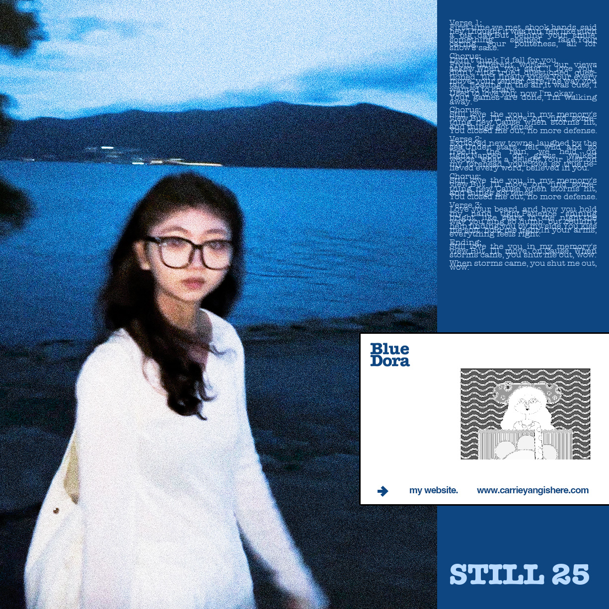
Carrie, 楊佳琍
—2024
October 20, 1998
Born in HuBei
Lives in HaiKou
Works in ShenZhen
Born in HuBei
Lives in HaiKou
Works in ShenZhen
Bright eyes bright life.
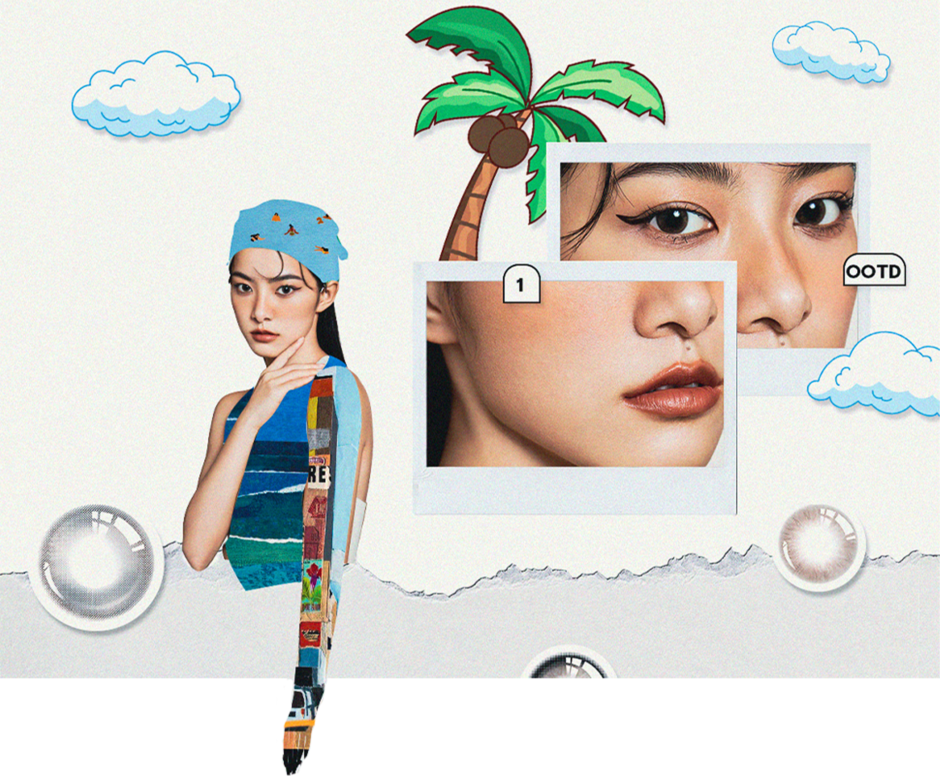
The visual style of kilala overseas is different from that in China. The audiences and cultures of different countries are very different. For the European, American and Southeast Asian markets, during the design process, we are often troubled by whether we should cater to the audiences of various countries or unify the brand style.
KILALA海外的视觉风格同国内有所不同,受众人群及各国文化的差异甚远,面向欧美及东南亚市场,设计过程中常常会被应该去迎合各国受众还是统一品牌风格而苦恼。
Kilala 2023—2024︎︎︎
Design/Overseas, 資深海外設計
Design/Overseas, 資深海外設計
Main Desgin/Display, 平面主设计-陈列板块
—2023
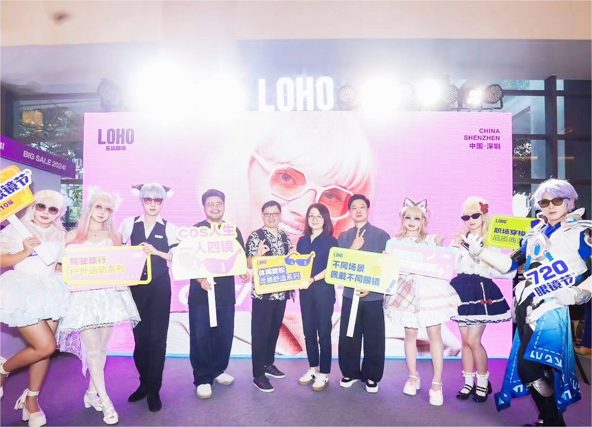
Loho/Roadshow︎︎︎
線下路演
線下路演
Glasses are the image —what loho wants to convey and hope to be remembered by the public.
Young, trendy, and accessories-oriented, on this basis, the offline roadshow is designed. The theme of this time is "style up". The extended design of graphics and color matching are relatively public. The exhibition venue is in a dazzling shopping mall, and the transmission of information is Be direct and eye-catching within the brand’s specifications.
年轻、潮流、配饰化,在这些关键词的基础上对2023年的线下路演进行设计。这次的主题为“style up”,展会地位于较为令人眼花缭乱的购物中心,图形的延伸设计及配色都需要醒目,反之文本信息的传递要更简约直白。
More
Art Director, 美術指導
—2022
Chxxxl/Branding
服裝品牌︎︎︎
服裝品牌︎︎︎
Find your inner.
The visual identity system upgrade of the chxxxl is presented in a minimalist but rebellious form, emphasizing the expression of "remodeling and deconstruction, destruction and rebirth".
CHXXXL的视觉识别系统升级以极简但叛逆的形式呈现,强调“重塑与解构,破坏与重生”的表达。
The visual identity system upgrade of the chxxxl is presented in a minimalist but rebellious form, emphasizing the expression of "remodeling and deconstruction, destruction and rebirth".
CHXXXL的视觉识别系统升级以极简但叛逆的形式呈现,强调“重塑与解构,破坏与重生”的表达。
More

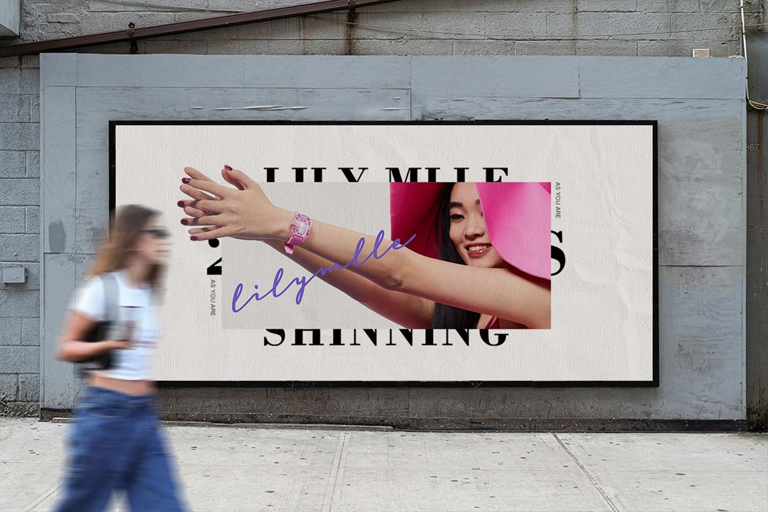
LilyMlle/Jewelry
珠寶品牌︎︎︎
珠寶品牌︎︎︎
LILY MLLE's visual identity system is based on light jewelry and light fashion.
It is different from the design of the product itself. The packaging diverges around the keyword "light", focusing on conveying nature, daily life, romance, and relaxation, so that the concept of jewelry is closely related to consumers. Shorten the distance between jewelry and consumers, and create fashion accessories suitable for different occasions.
LILY MLLE视觉识别系统以轻珠宝、轻时尚为基准,区别于产品本身的设计,包装围绕“轻”一关键词发散,着重传达自然、日常、浪漫、松弛,使珠宝这一概念与消费者之间缩短距离, 打造适合不同场合的时尚饰品 。
More
MadeByMe/BrandCollection/Logo
品牌集合店ui︎︎︎
品牌集合店ui︎︎︎
The new dimension of information explosion, everyone can become an in fluencer.
MADE BY ME is a brand collection store, serving CHXXXL/IAMNOT/HXXXXS/LILY MLLE and other brands.The interface style is mainly simple and individual, and the LOGO design continues the company's previous simplicity and high recognition.
MADE BY ME为一家品牌集合店,主服务于CHXXXL/IAMNOT/HXXXXS/LILY MLLE等品牌,界面风格以简约个性为主,在LOGO的设计上延续了公司以往直白及高辨识。
More
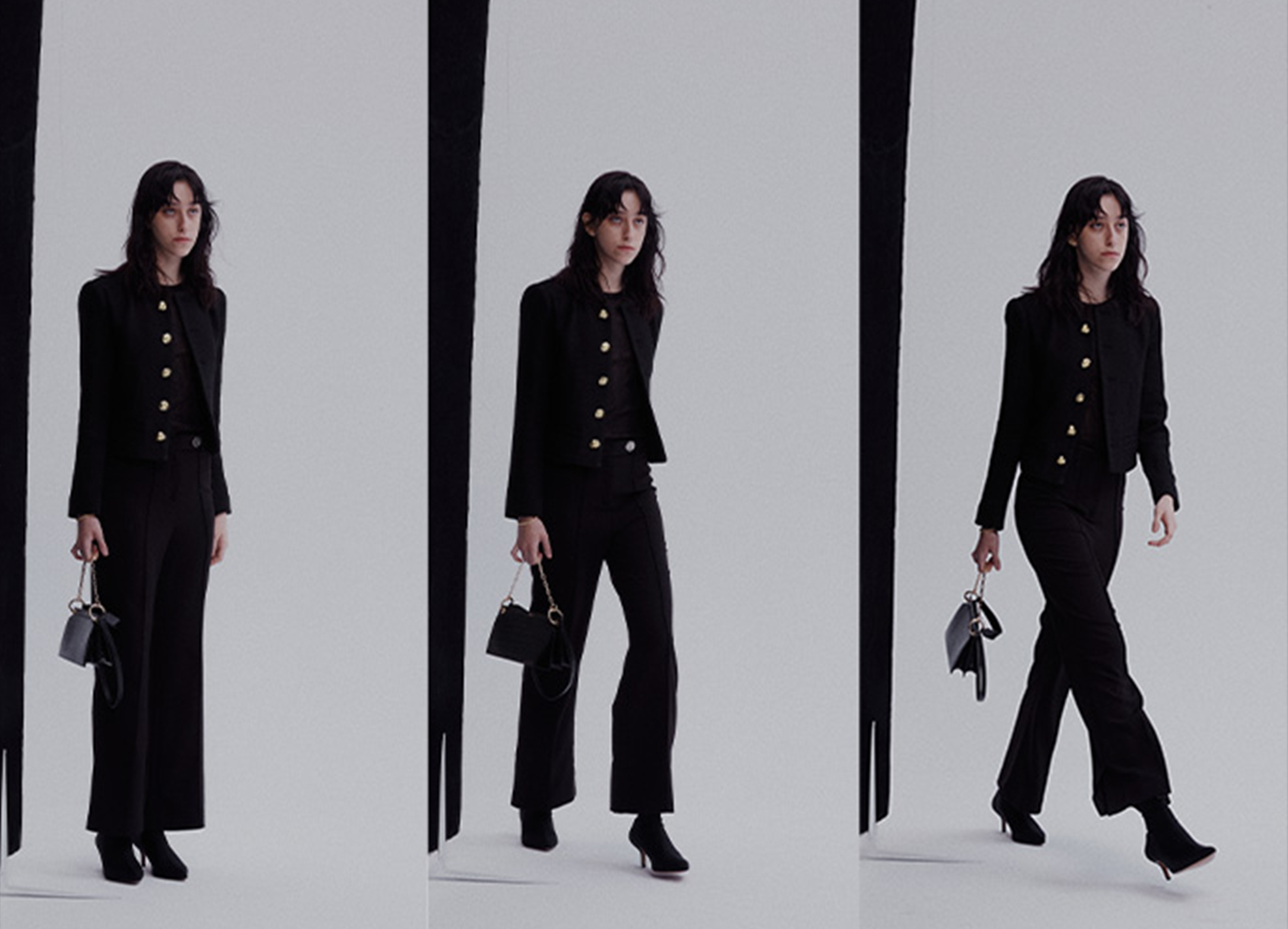
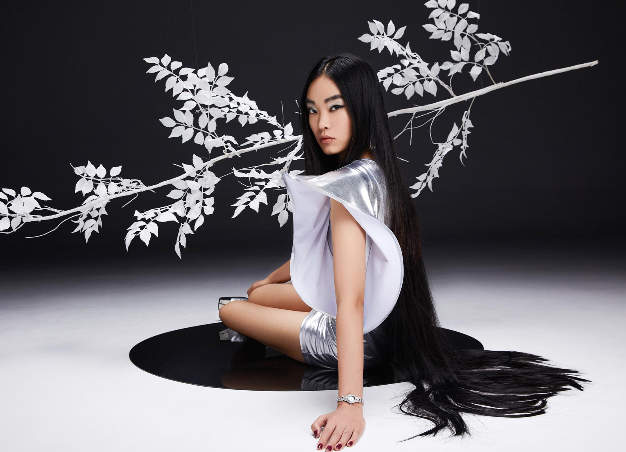
BrandImage/LookBook
形象片及look拍攝︎︎︎
形象片及look拍攝︎︎︎
The shooting of the character image film is inspired by the four seasons
Using time as the concept foreshadowing, visually presenting spring, summer, autumn and winter, so that each product with different styles can be expressed in a suitable way. Still life shooting is required for drainage and promotion. Because the consumer group and actual group positioned by the brand in the early stage are relatively vague, so the direction of different scenes will be tried a little bit.
人物形象片的拍摄灵感源于四季,以时间做为概念铺垫,将春夏秋冬以视觉呈现,使每款风格迥异的产品都能得到与之契合的表达。静物拍摄则为引流推广所需,因品牌前期所定位的消费群体及实际群体较为模糊,所以不同场景的走向都会稍加尝试。
More
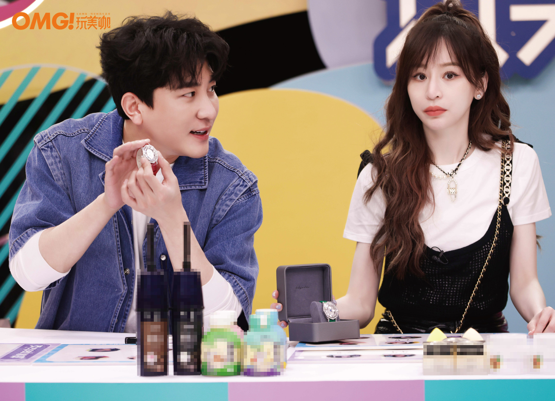
Campaign/LilyMlle
推廣活動︎︎︎
推廣活動︎︎︎
This promotion is mainly to attract traffic for the 2022 Valentine's Day online event.
In order to more eye-catchingly highlight the luster of the product, a watch box with a relatively neutral color was chosen in the initial stage, but it is still used in the promotion of the event. The brand color is used as the main tone.
此次的推广主要是为2022情人节的线上活动做引流,在包装上为了能更醒目的衬托出产品的光泽,选择了初期颜色较为中性的表盒,但在活动的宣传上仍使用品牌色做为主调。
More
Brand Design, 品牌主設計
—2021
Aiwolv /Branding︎︎︎
Find your way.
The brand visual identity system of Aiwolu is developed around the choice of road, to advocate modern young people to break stereotypes, dare to try, have the courage to sing "I did it my way", and support every kind of self-confidence, health and breakthrough lifestyle.
爱我路品牌视觉识别系统,围绕道路的选择而开展,以倡导现代年轻人打破成见、敢于尝试、 有唱出“I did it my way”的勇气, 并支持每一种自信、健康和突破的生活方式。
More

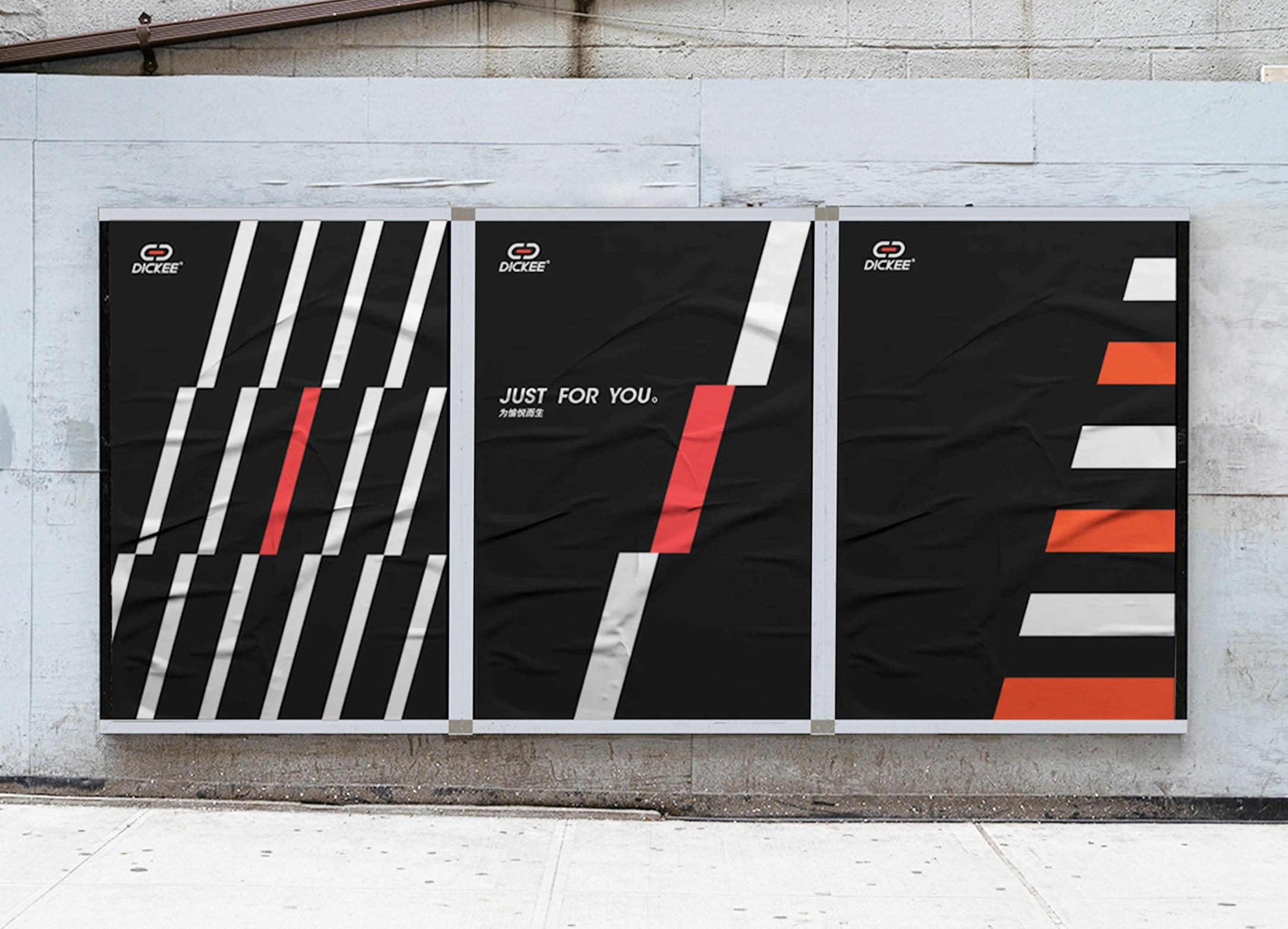
Dickee /Branding︎︎︎
Logo upgrade.
Standardized drawing based on the original LOGO thermometer graphics, the letter "K" is removed from the arc, showing a sharp and stable state. The whole combination is rounded up and down, combining rigidity and softness. Red represents passion, challenge, and passion, and the arc represents soft protection. It will accompany you to challenge various extreme sports and enhance the pleasure of enjoying sports.
LOGO升级,在原有LOGO温度计图形基础上进行标准化制图,字母”K“圆弧去除,呈现尖锐稳定状态。整个组合上圆下方,刚柔并济。红色代表激情、挑战、热血,圆弧则代表软防护,伴随你挑战各种极限运动,提升享受运动带来的愉悦感。
More
LayOut, 設計
—TheOther
Design︎︎︎
The content includes work and personal creation.
There is no fixed style for the time being, and it is still in the stage of exploration, but I like to mix the fonts together and blend them with the screen to generate interest.
选取了工作及个人内容 ,暂时没有什么固定的风格,仍处于摸索阶段,但喜好偏向于将字体打乱拼凑,再与画面重组融合产生趣味。
More

©️CARRIEYANGISHERE
©️CARRIEYANGISHERE
WELCOME
TO MY WEBSITE
HOPE TO
︎︎︎MEET YOU ONE DAY
Carrie, 楊佳琍
平面設計師/美術指導/存在主義/天秤座/B型血/Z世代
October 20, 1998
Born in Hubei
Lives in Haikou
Works in ShenZhen
Born in Hubei
Lives in Haikou
Works in ShenZhen
I just want to make myself happy in my limited life.
Hello, I believe the keyword tags above have helped you get a general idea of me. I have been working for nearly four years. I majored in Business English and am very interested in art and creation. I am good at illustration, design, and creativity. If you need any cooperation, please click the email address in the lower left corner to contact me.
你好,相信上面的關鍵詞標籤已經幫助您大致的了解我了,我工作至今將近四年,商務英語專業,對藝術及创作十分感興趣,擅長插畫、設計、創意,若有合作需要請點擊左下角的郵箱號與我聯繫。