©️CARRIEYANGISHERE
PART OF
︎︎︎MY WORK
FROM 2021
TO 2024
2024, 資深海外品牌設計
—Kilala
Overseas/Design
東南亞/歐美/俄羅斯︎︎︎
東南亞/歐美/俄羅斯︎︎︎
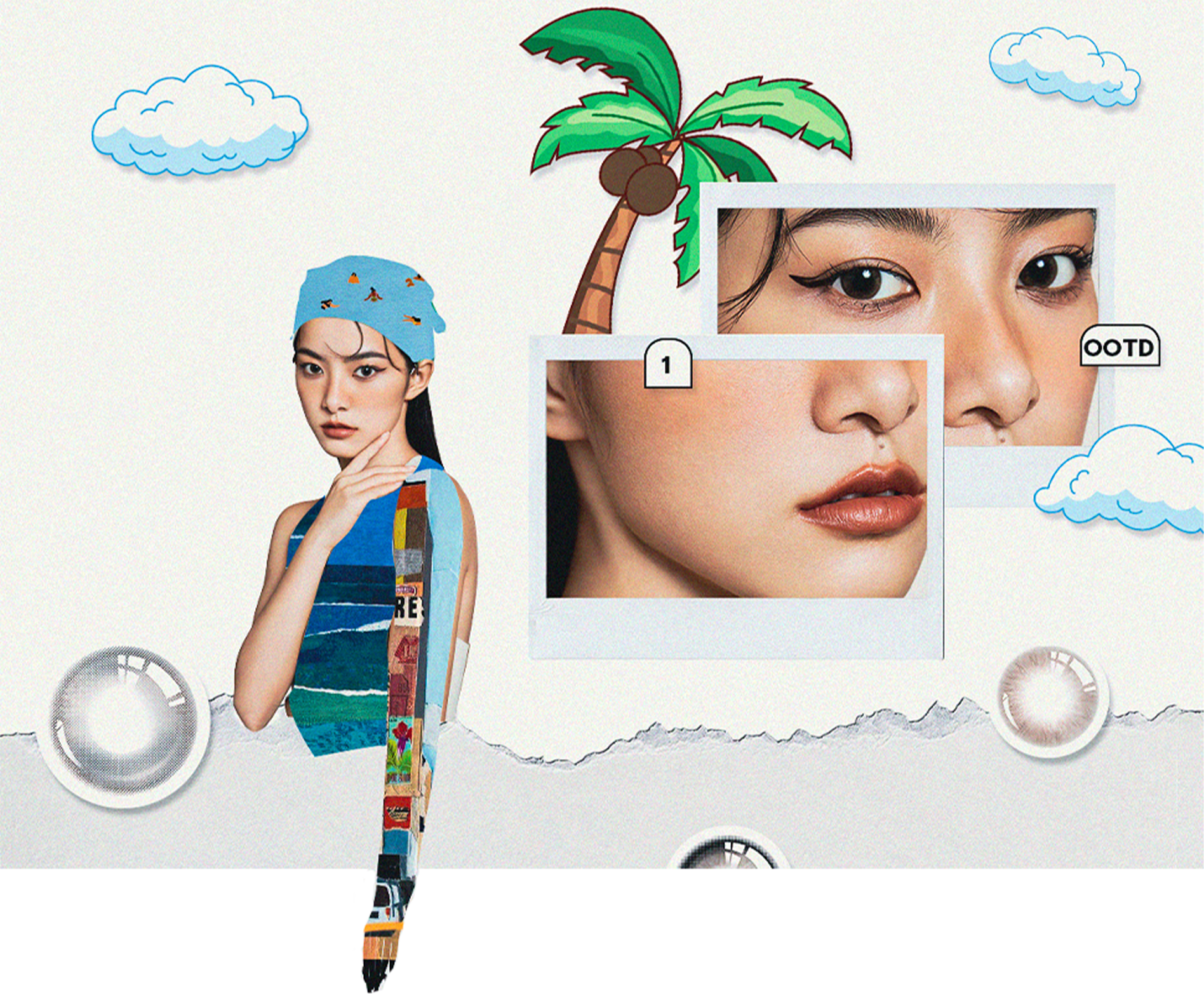
Bright eyes bright life.
The visual style of kilala overseas is different from that in China. The audiences and cultures of different countries are very different. For the European, American and Southeast Asian markets, during the design process, we are often troubled by whether we should cater to the audiences of various countries or unify the brand style.
The visual style of kilala overseas is different from that in China. The audiences and cultures of different countries are very different. For the European, American and Southeast Asian markets, during the design process, we are often troubled by whether we should cater to the audiences of various countries or unify the brand style.
2023, 陳列平面主設計
—Loho
Loho/Roadshow
線下路演︎︎︎
線下路演︎︎︎
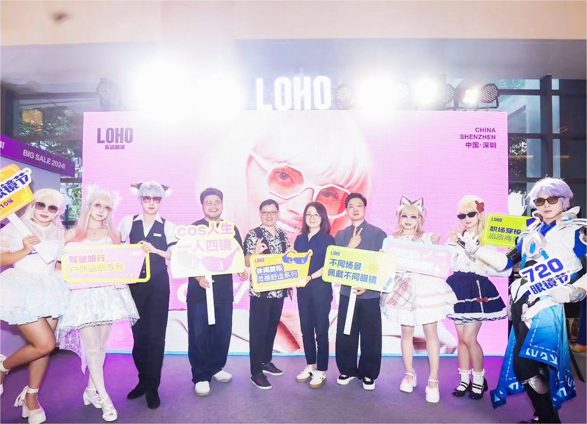
Glasses are the image —what loho wants to convey and hope to be remembered by the public.
Young, trendy, and accessories-oriented, on this basis, the offline roadshow is designed. The theme of this time is "style up". The extended design of graphics and color matching are relatively public. The exhibition venue is in a dazzling shopping mall, and the transmission of information is Be direct and eye-catching within the brand’s specifications.
Young, trendy, and accessories-oriented, on this basis, the offline roadshow is designed. The theme of this time is "style up". The extended design of graphics and color matching are relatively public. The exhibition venue is in a dazzling shopping mall, and the transmission of information is Be direct and eye-catching within the brand’s specifications.
2022, 美術指導
—Chxxxl
LookBook/Branding
時尚相關︎︎︎
時尚相關︎︎︎
FIND YOUR INNER.
The visual identity system upgrade of the chxxxl is presented in a minimalist but rebellious form, emphasizing the expression of "remodeling and deconstruction, destruction and rebirth".
The visual identity system upgrade of the chxxxl is presented in a minimalist but rebellious form, emphasizing the expression of "remodeling and deconstruction, destruction and rebirth".
2022, 美術指導
—LilyMlle
Branding / Campaign
珠寶品牌︎︎︎
珠寶品牌︎︎︎
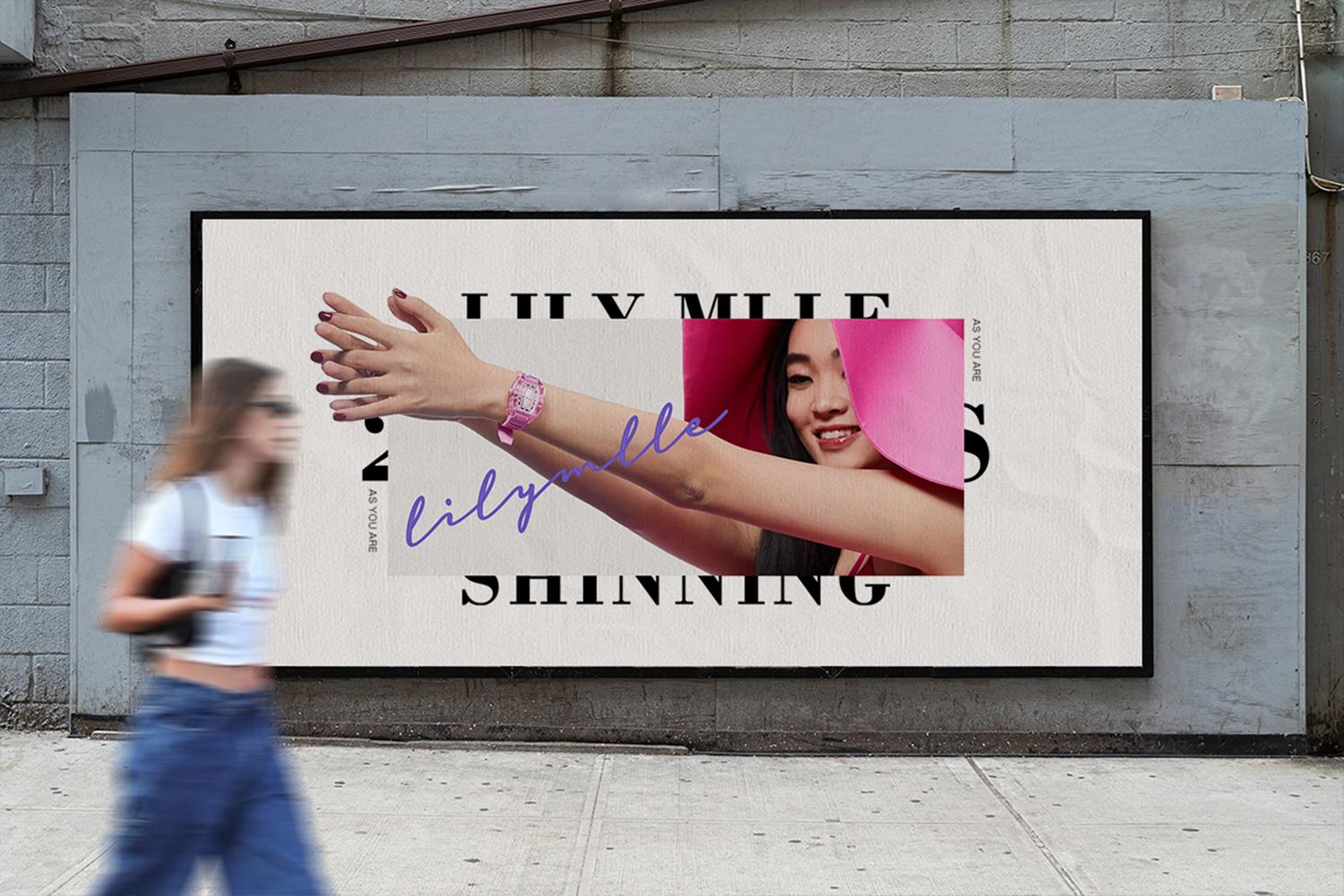
LILY MLLE's visual identity system is based on light jewelry and light fashion.
It is different from the design of the product itself. The packaging diverges around the keyword "light", focusing on conveying nature, daily life, romance, and relaxation, so that the concept of jewelry is closely related to consumers. Shorten the distance between jewelry and consumers, and create fashion accessories suitable for different occasions.
It is different from the design of the product itself. The packaging diverges around the keyword "light", focusing on conveying nature, daily life, romance, and relaxation, so that the concept of jewelry is closely related to consumers. Shorten the distance between jewelry and consumers, and create fashion accessories suitable for different occasions.
2022, 美術指導
—MadeByMe
User Interface / Logo
集合店介面設計︎︎︎
集合店介面設計︎︎︎
The new dimension of information explosion, everyone can become an in fluencer
MADE BY ME is a brand collection store, serving CHXXXL/IAMNOT/HXXXXS/LILY MLLE and other brands.The interface style is mainly simple and individual, and the LOGO design continues the company's previous simplicity and high recognition.
MADE BY ME is a brand collection store, serving CHXXXL/IAMNOT/HXXXXS/LILY MLLE and other brands.The interface style is mainly simple and individual, and the LOGO design continues the company's previous simplicity and high recognition.
2022-2024, 美術指導
—LookBook
Chxxxl/Iamnot/Kilala
look拍攝︎︎︎
look拍攝︎︎︎
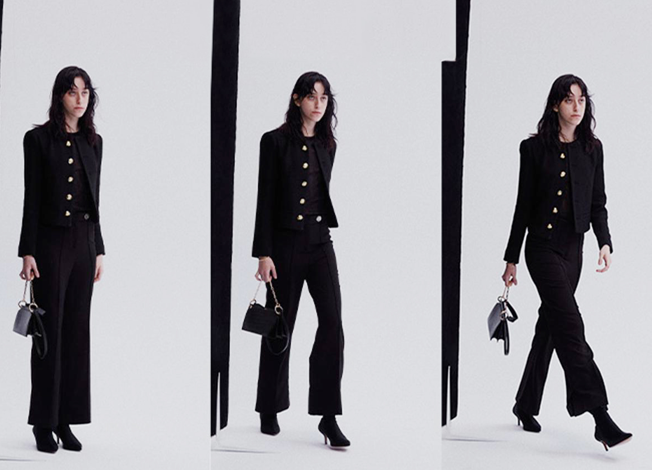
"In fashion,we are equal"
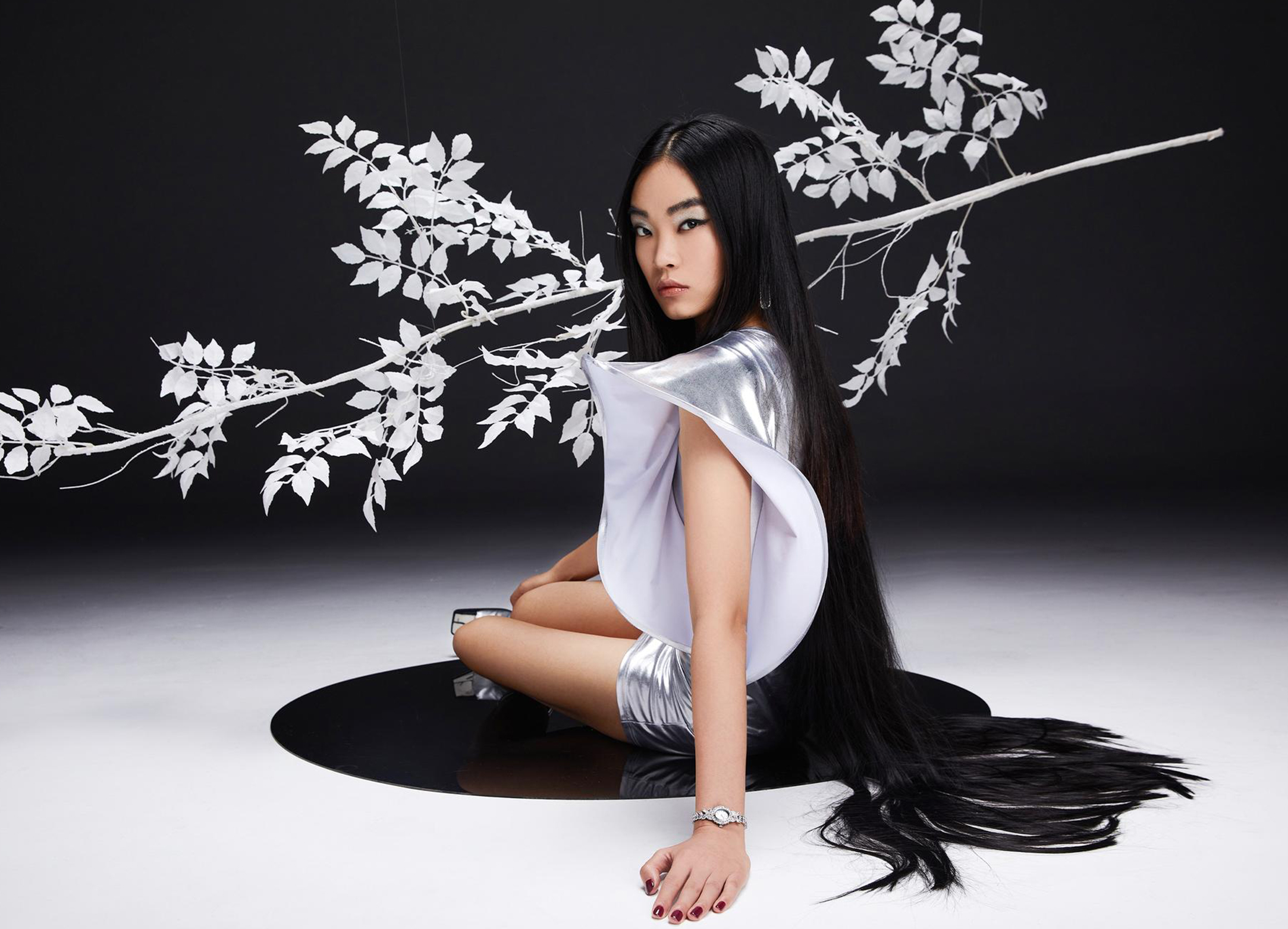
Through the contrast between the pure white background and the bold performance of the model, the concept of male and female is blurred, focusing on capturing the explosive emotions of the characters, implying breaking the tradition from a traditional perspective, so as to express the product.
Through the contrast between the pure white background and the bold performance of the model, the concept of male and female is blurred, focusing on capturing the explosive emotions of the characters, implying breaking the tradition from a traditional perspective, so as to express the product.
2022-2024, 美術指導
—BrandImage
LilyMlle/Kilala
形象片拍攝︎︎︎
形象片拍攝︎︎︎
"In fashion,we are equal"
Through the contrast between the pure white background and the bold performance of the model, the concept of male and female is blurred, focusing on capturing the explosive emotions of the characters, implying breaking the tradition from a traditional perspective, so as to express the product.
Through the contrast between the pure white background and the bold performance of the model, the concept of male and female is blurred, focusing on capturing the explosive emotions of the characters, implying breaking the tradition from a traditional perspective, so as to express the product.
2021, 品牌主設計
—Aiwolv
Vi/Design
規範設計︎︎︎
規範設計︎︎︎
Find your way.
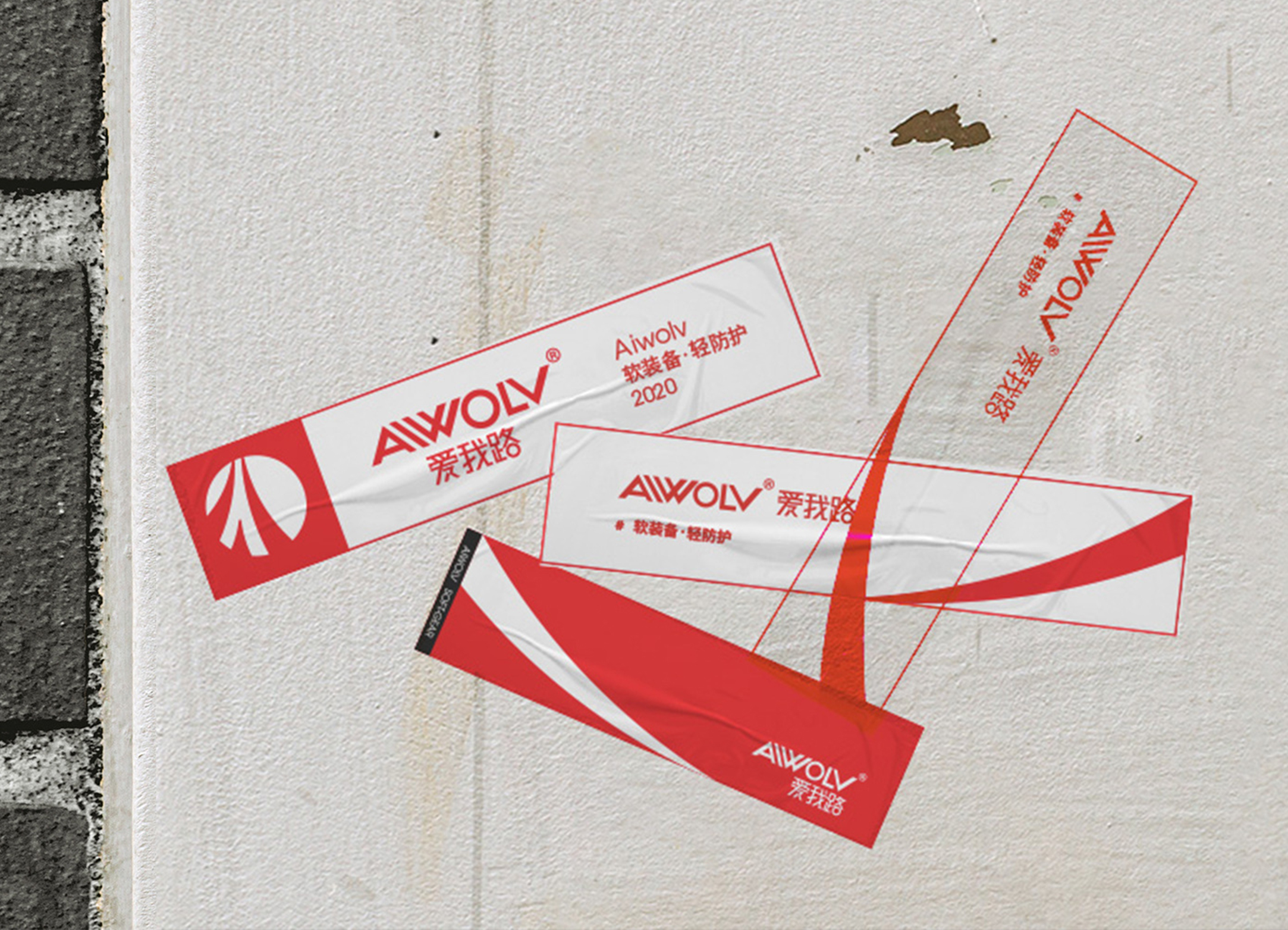
The brand visual identity system of Aiwolu is developed around the choice of road, to advocate modern young people to break stereotypes, dare to try, have the courage to sing "I did it my way", and support every kind of self-confidence, health and breakthrough lifestyle.
The brand visual identity system of Aiwolu is developed around the choice of road, to advocate modern young people to break stereotypes, dare to try, have the courage to sing "I did it my way", and support every kind of self-confidence, health and breakthrough lifestyle.
2021, 品牌設計
—Dickee
Poster/LogoUpgrade
logo升級︎︎︎
logo升級︎︎︎
Logo upgrade.
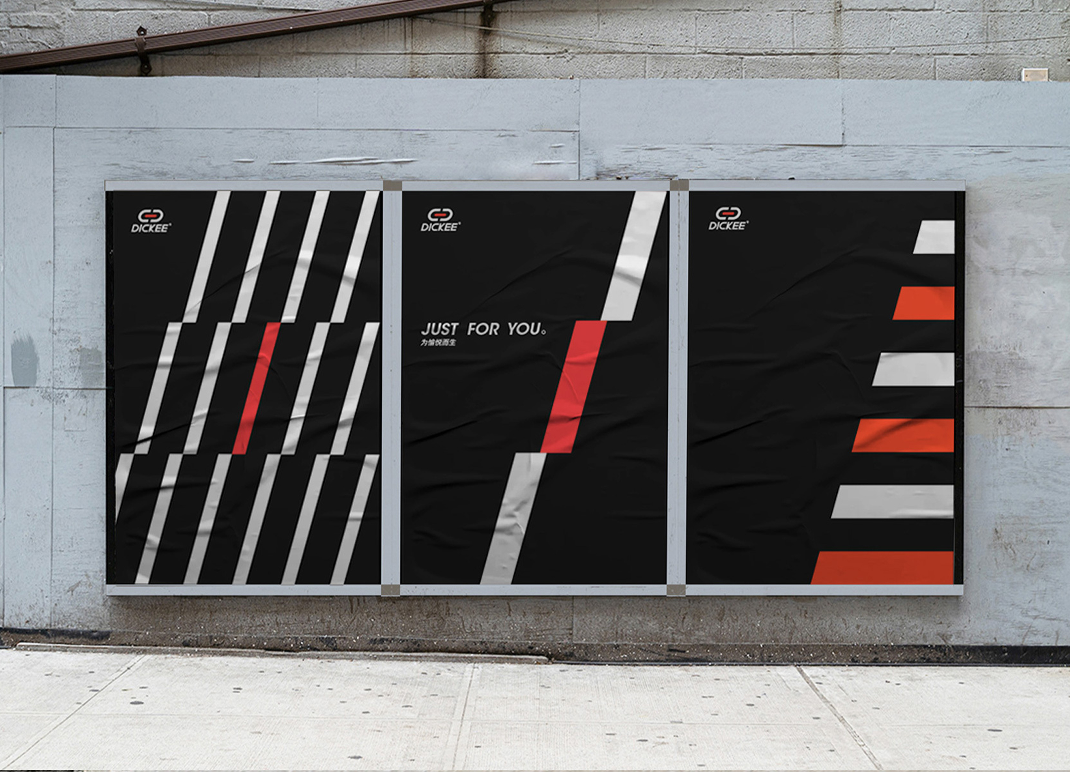
Standardized drawing based on the original LOGO thermometer graphics, the letter "K" is removed from the arc, showing a sharp and stable state. The whole combination is rounded up and down, combining rigidity and softness. Red represents passion, challenge, and passion, and the arc represents soft protection. It will accompany you to challenge various extreme sports and enhance the pleasure of enjoying sports.
Standardized drawing based on the original LOGO thermometer graphics, the letter "K" is removed from the arc, showing a sharp and stable state. The whole combination is rounded up and down, combining rigidity and softness. Red represents passion, challenge, and passion, and the arc represents soft protection. It will accompany you to challenge various extreme sports and enhance the pleasure of enjoying sports.
2021-2024, 設計
—Poster
Poster/KV
海報設計︎︎︎
海報設計︎︎︎
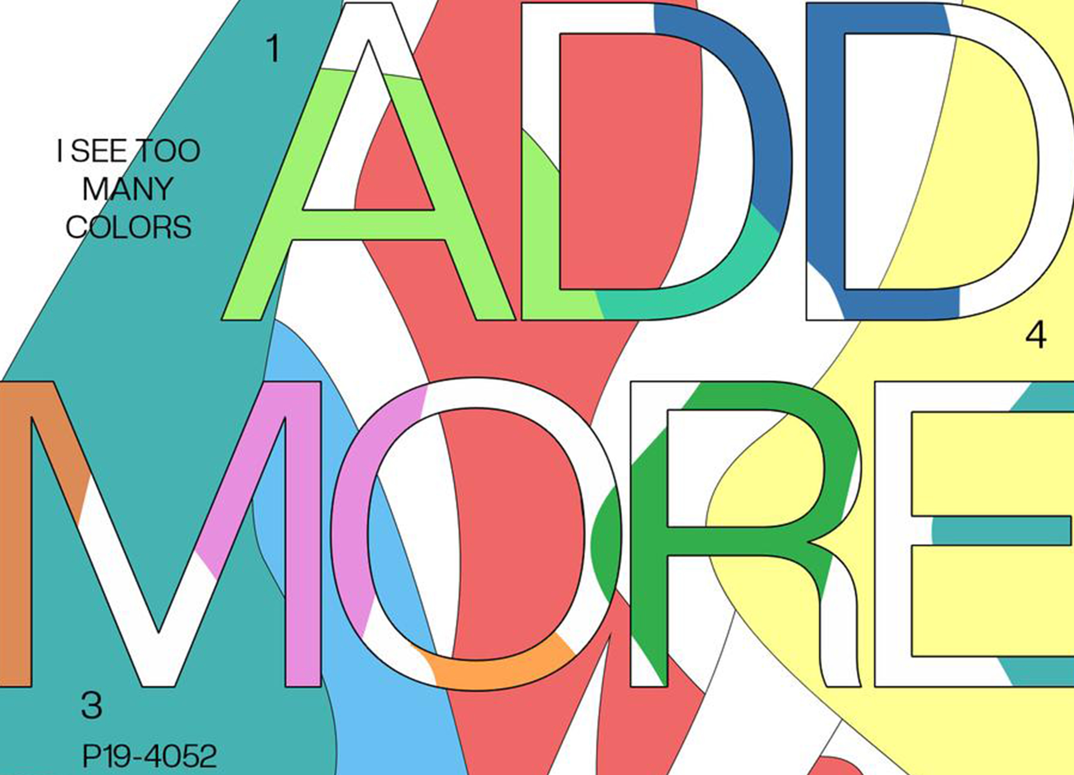
The content includes work and personal creation. There is no fixed style for the time being, and it is still in the stage of exploration, but I like to mix the fonts together and blend them with the screen to generate interest.
Images
©CARRIEYANGISHERE
︎BLUEDORA
︎THE SONG I WROTE
