︎SHENZHEN,CHINA
︎DESIGNER,ART DIRECTOR
©️CARRIEYANGISHERE


︎DESIGN,ART DIRECTOR
︎GUANGDONG,SHENZHEN


LILYMLLE/CAMPAIGN


︎ JEWELRY BRAND
︎ BRANDING / VISUAL IDENTITY / PACKAGING /DESIGN / CAMPAIGN / POSTER


︎︎︎ DESIGN
︎︎︎ ART DIRECTION


LILY MLLE's visual identity system is based on light jewelry and light fashion. It is different from the design of the product itself. The packaging diverges around the keyword "light", focusing on conveying nature, daily life, romance, and relaxation, so that the concept of jewelry is closely related to consumers. Shorten the distance between jewelry and consumers, and create fashion accessories suitable for different occasions.

LILY MLLE视觉识别系统以轻珠宝、轻时尚为基准,区别于产品本身的设计,包装围绕“轻”一关键词发散,着重传达自然、日常、浪漫、松弛,使珠宝这一概念与消费者之间缩短距离, 打造适合不同场合的时尚饰品 。


︎︎︎ MADEBYME
︎︎︎ LOOKBOOK
︎︎︎ BRAND IMAGE


CARRIE IS HERE   CARRIE IS HERE  CARRIE IS HERE    CARRIE IS HERE   CARRIE


DESIGN。ART DIRECTION。

︎︎︎

品牌推广。美指。


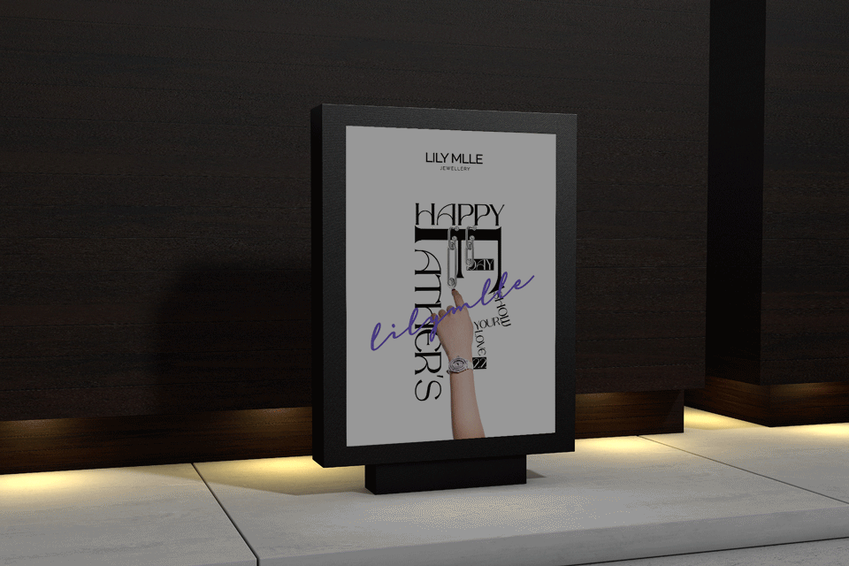
Both logo and auxiliary elements use the spelling of LILY MLLE, which is distinguished by sans serif and handwriting. In daily use, thick serif or irregular serif is also used as text identification to create a "light formal, high recognition "Effect. The use of the main color purple is to consider the public’s inherent impression of jewelry, a little luxury and mystery, and integrate it to deepen the relationship, but avoid large areas of high saturation in use, and the picture should be as simple and light as possible, conveying a touch of vitality and elegance.


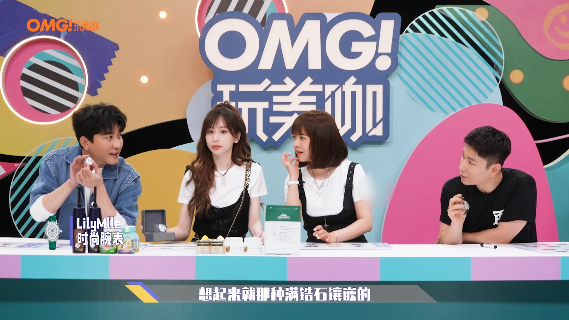
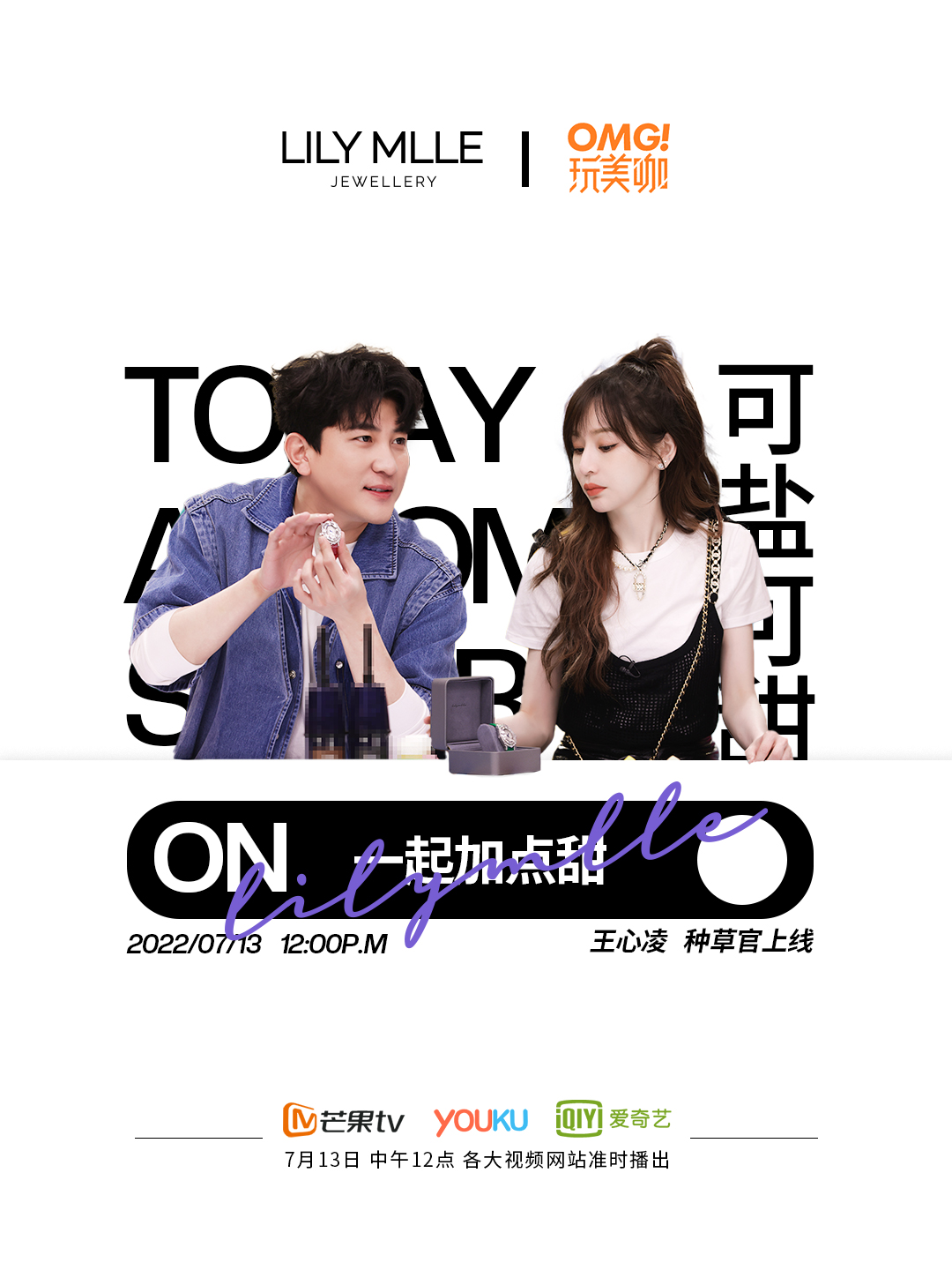
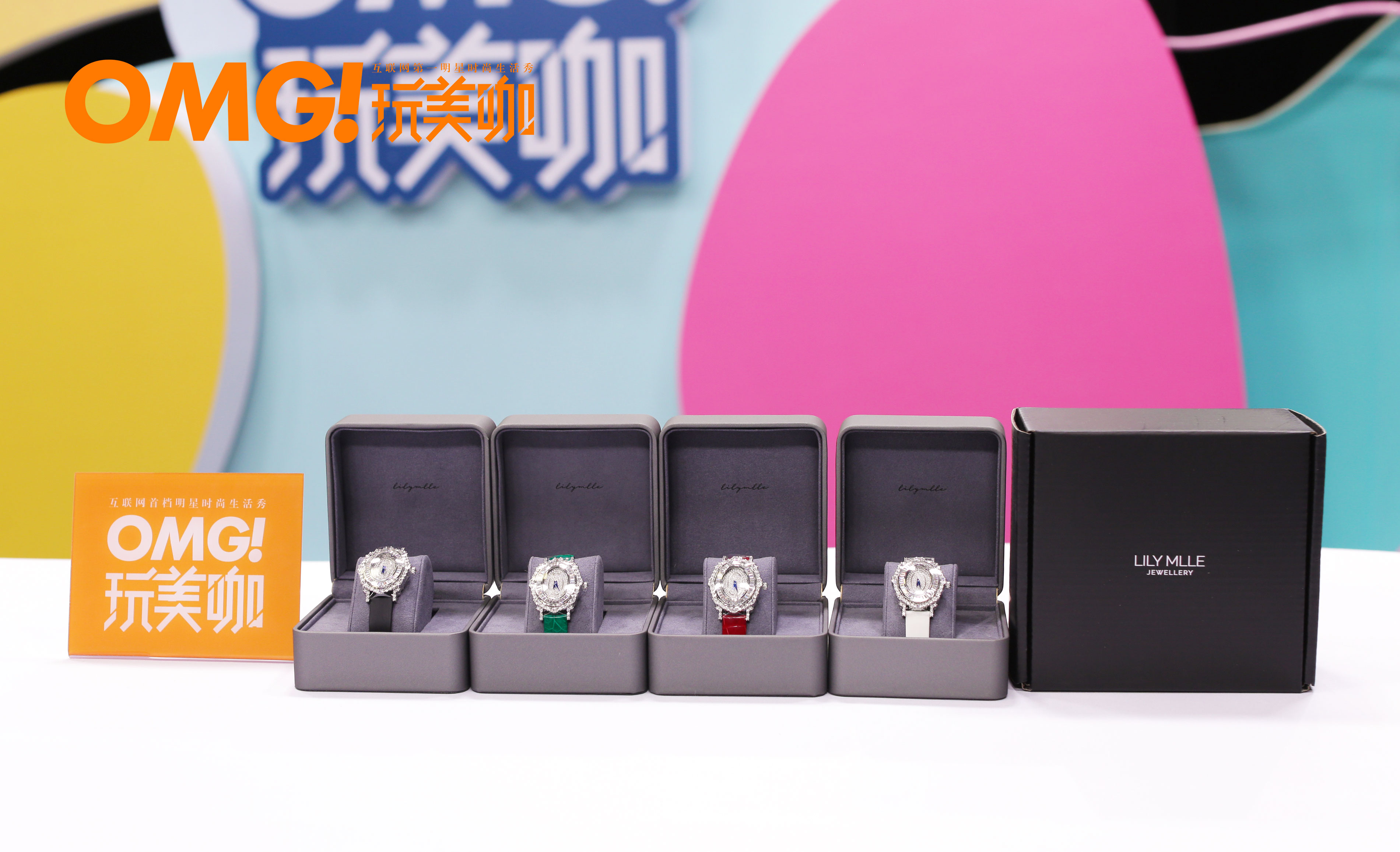
次此的推广主要是为2022情人节的线上活动做引流,在包装上为了能更醒目的衬托出产品的光泽,选择了初期颜色较为中性的表盒,但在活动的宣传上仍使用品牌色做为主调。