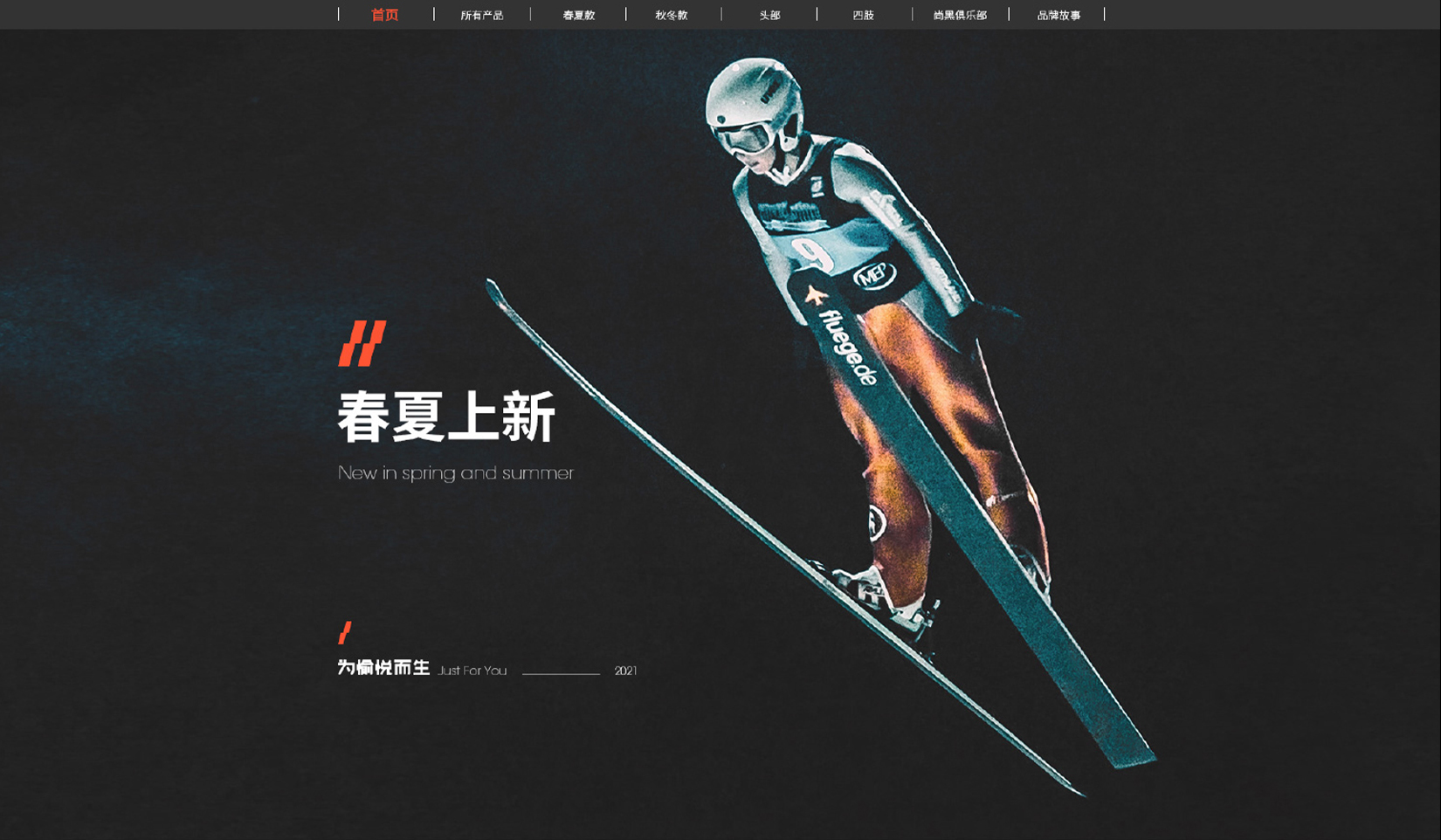
︎SHENZHEN,CHINA
︎DESIGNER,ART DIRECTOR
©️CARRIEYANGISHERE


︎DESIGN,ART DIRECTOR
︎GUANGDONG,SHENZHEN


DESIGN。

︎︎︎

担任设计。执行。


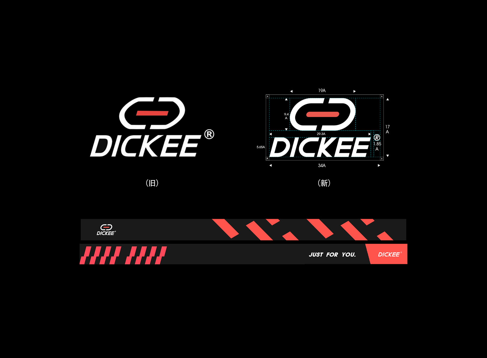
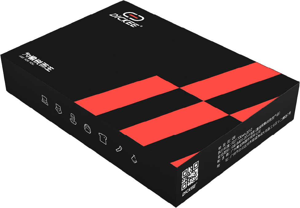
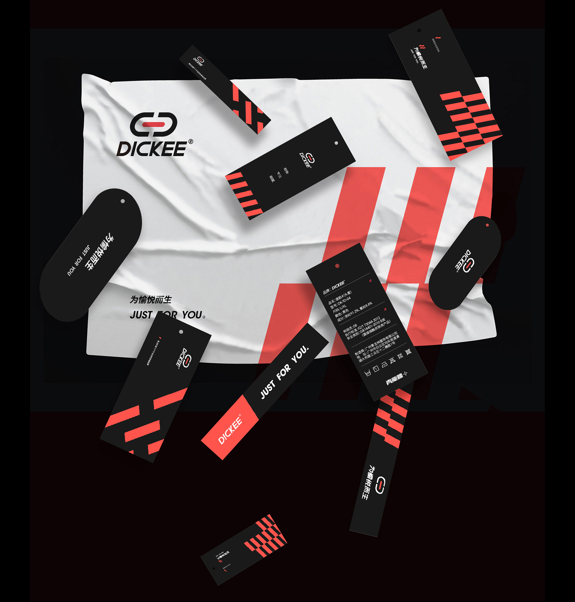
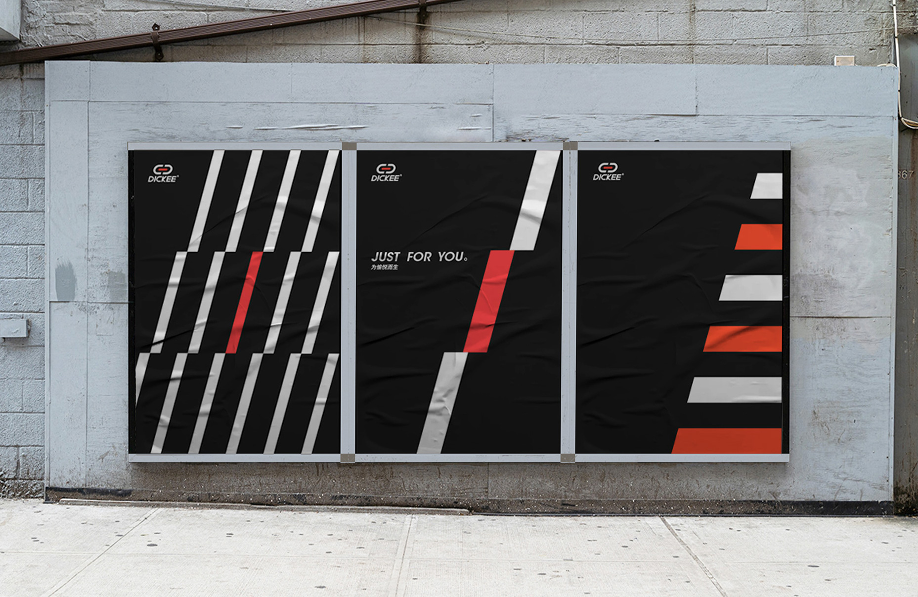
The auxiliary graphics extract the cuboid in the center of the logo, and use black, white and red to piece together the black and white checkered flag in the competition, expressing the spirit of adventure advocated by the brand.


辅助图形提取了logo中心的长方体,以黑白红配色拼凑出形似竞赛中的黑白格子旗,将品牌所提倡的冒险精神及加以表达。


DICKEE


︎ LOGO UPGRADE
︎ BRANDING / LOGO DESIGN / PACKAGING / POSTER


︎︎︎ DESIGN


Logo  upgrade, standardized drawing based on the original LOGO thermometer graphics, the letter "K" is removed from the arc, showing a sharp and stable state. The whole combination is rounded up and down, combining rigidity and softness. Red represents passion, challenge, and passion, and the arc represents soft protection. It will accompany you to challenge various extreme sports and enhance the pleasure of enjoying sports.


LOGO升级,在原有LOGO温度计图形基础上进行标准化制图,字母”K“圆弧去除,呈现尖锐稳定状态。整个组合上圆下方,刚柔并济。红色代表激情、挑战、热血,圆弧则代表软防护,伴随你挑战各种极限运动,提升享受运动带来的愉悦感。


︎︎︎ MADEBYME
︎︎︎ LOOKBOOK
︎︎︎ BRAND IMAGE


CARRIE IS HERE   CARRIE IS HERE  CARRIE IS HERE    CARRIE IS HERE   CARRIE