Design,Art direction
担任设计及美指
-
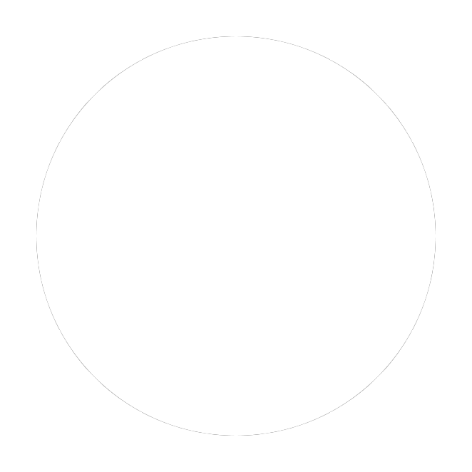
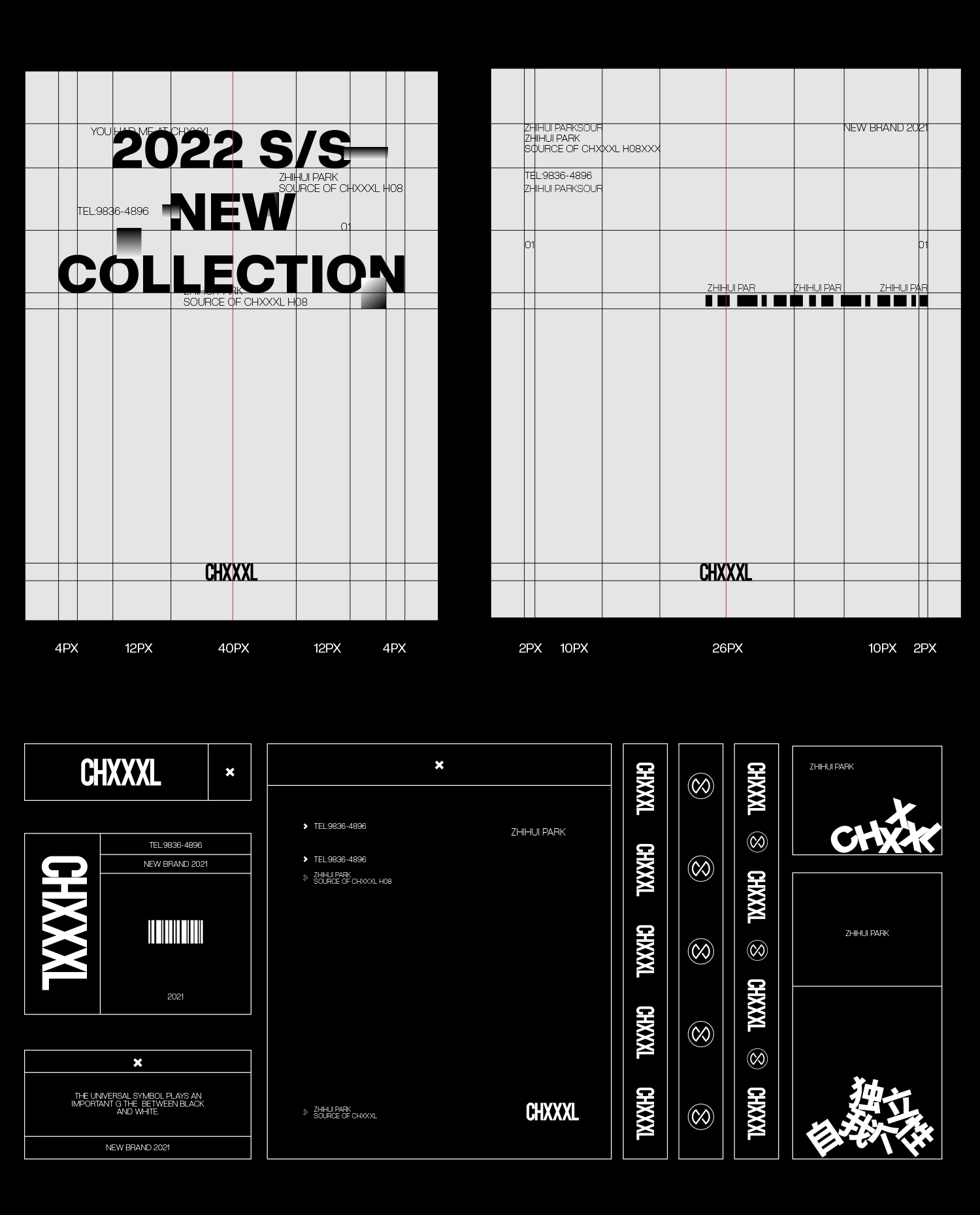
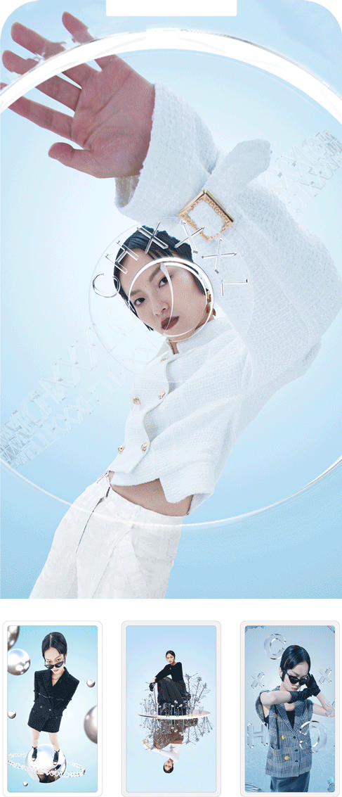
The logo uses a sans-serif seamless connection method, with black and white colors, to present simplicity and classics in a concrete way, implying the inheritance of the past and connection to the future.The design of the brand symbol pattern uses a tough straight line as a transition, and connects 2/4 of the circle to make it resemble infinite but sharp edges and corners, thus conveying the rebellion and diversity advocated by CHXXXL; the cross in the center The incisions separated by one side of the point suggest different outlets for self-expression.
Logo通过无衬线无缝隙的连接方式,搭配黑白两色,具像化的呈现简约及经典,寓意着继承过去,连接未来。品牌符号图案的设计,则是以硬朗的直线作为过渡,将圆的2/4交叉连接,使之酷似无限但又棱角分明,由此将CHXXXL所主张的反叛及多元化进行传递;中心的交叉点一方所分隔的切口,暗示着表达自我的不同出口。
Logo通过无衬线无缝隙的连接方式,搭配黑白两色,具像化的呈现简约及经典,寓意着继承过去,连接未来。品牌符号图案的设计,则是以硬朗的直线作为过渡,将圆的2/4交叉连接,使之酷似无限但又棱角分明,由此将CHXXXL所主张的反叛及多元化进行传递;中心的交叉点一方所分隔的切口,暗示着表达自我的不同出口。

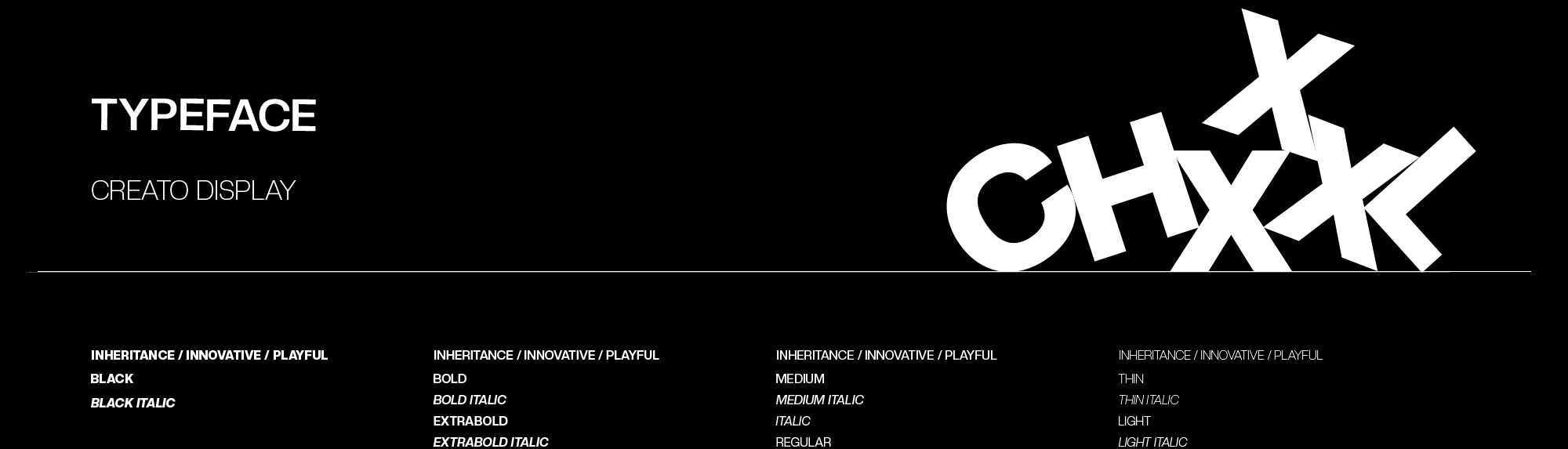
Logo。Pattern。
︎︎︎
标志。图案。

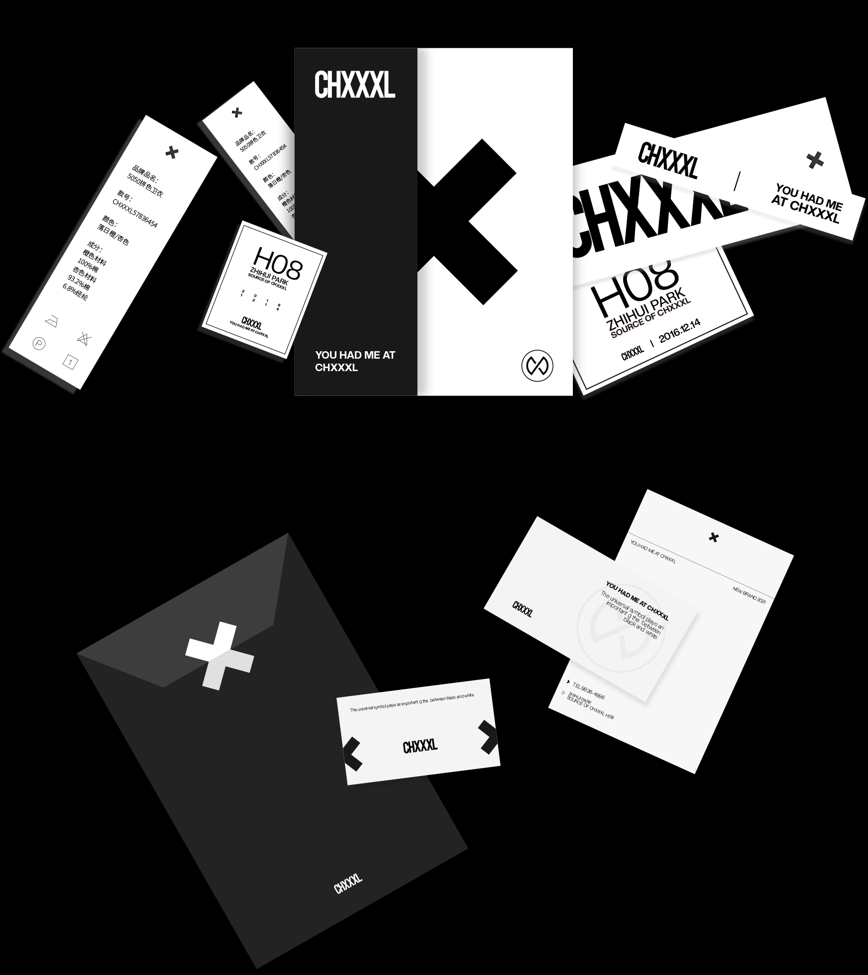
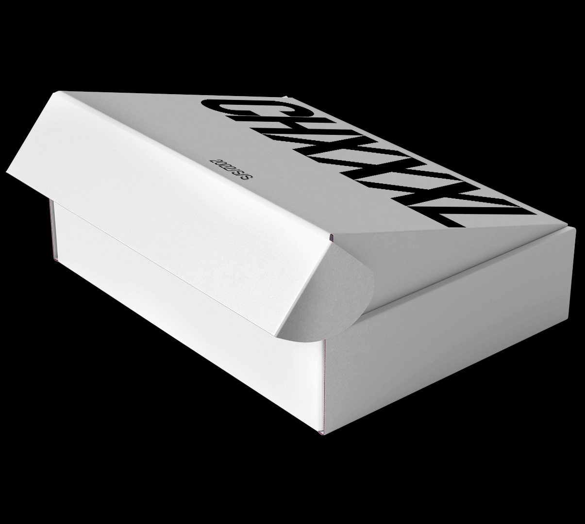
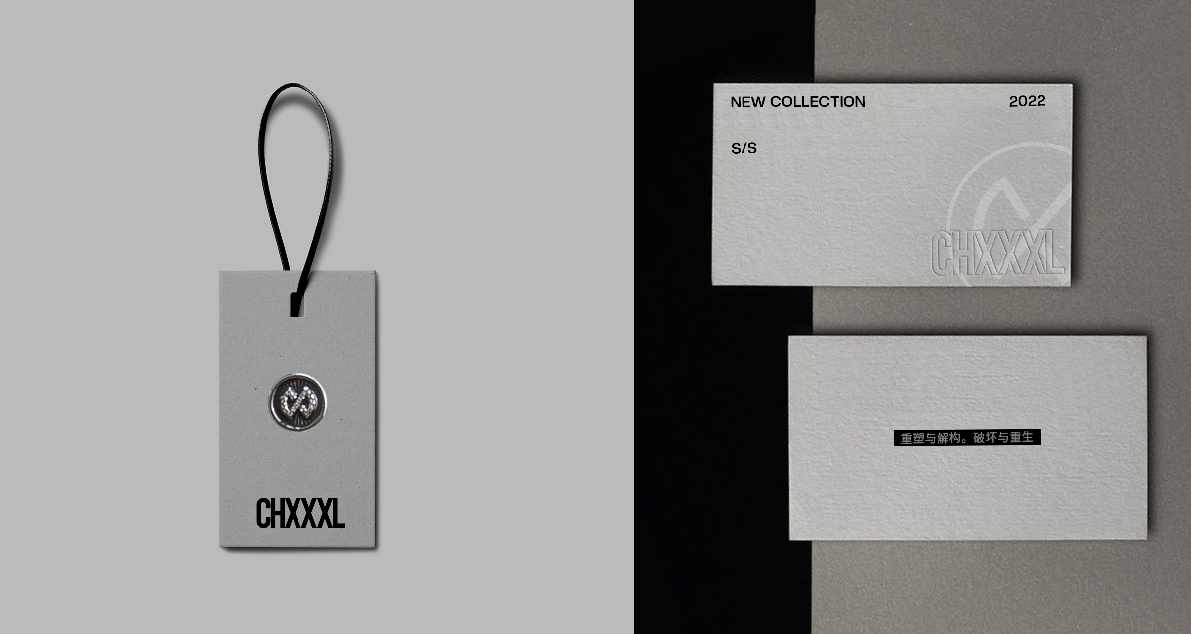
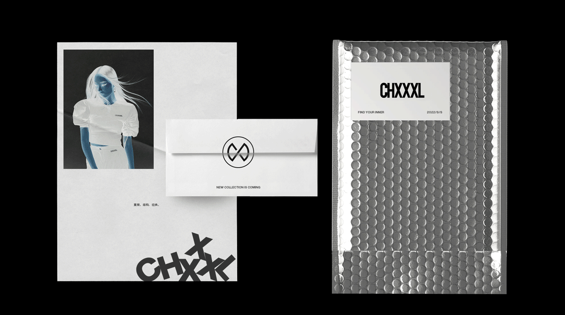

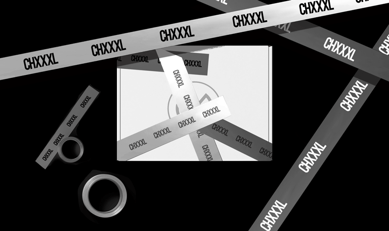
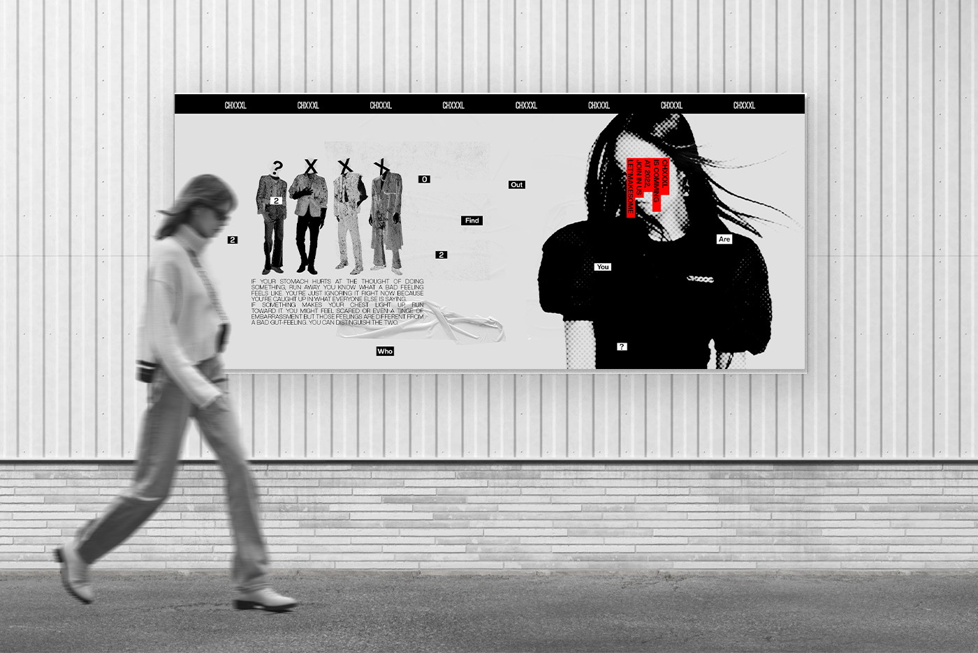
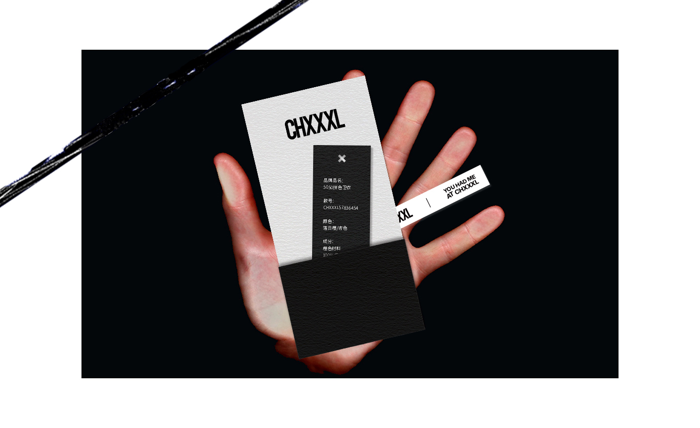
Packaging。Poster。
︎︎︎
包装。延用。
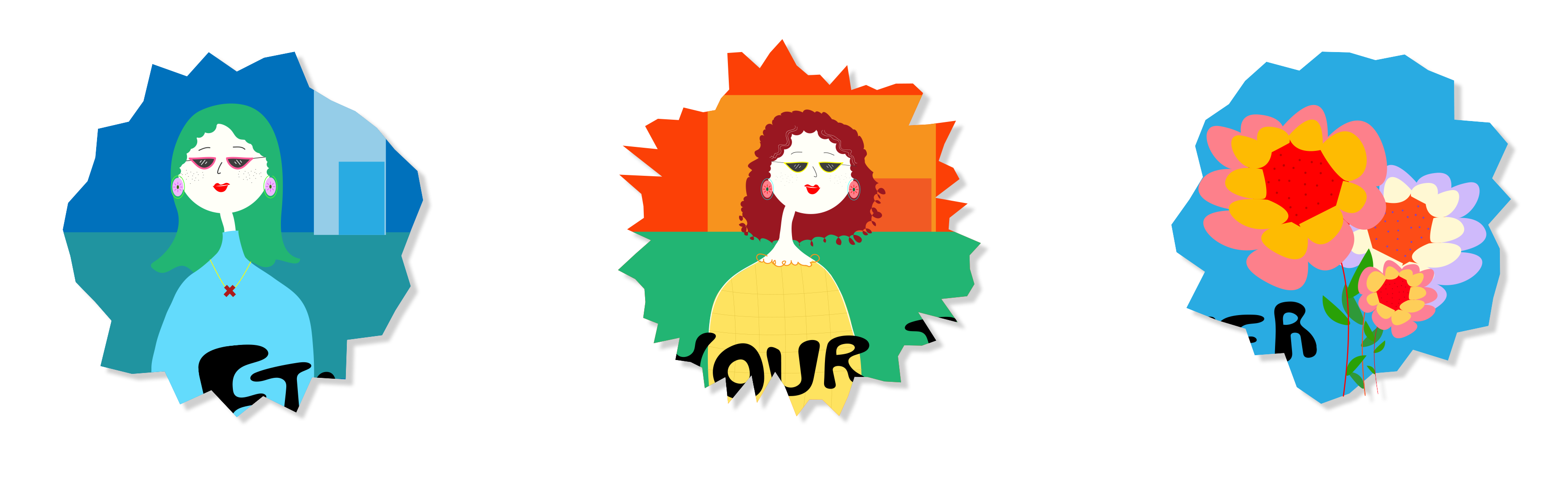
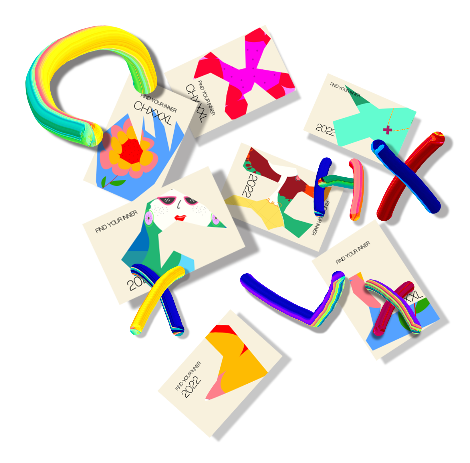
Illustration。
插画。包装
-
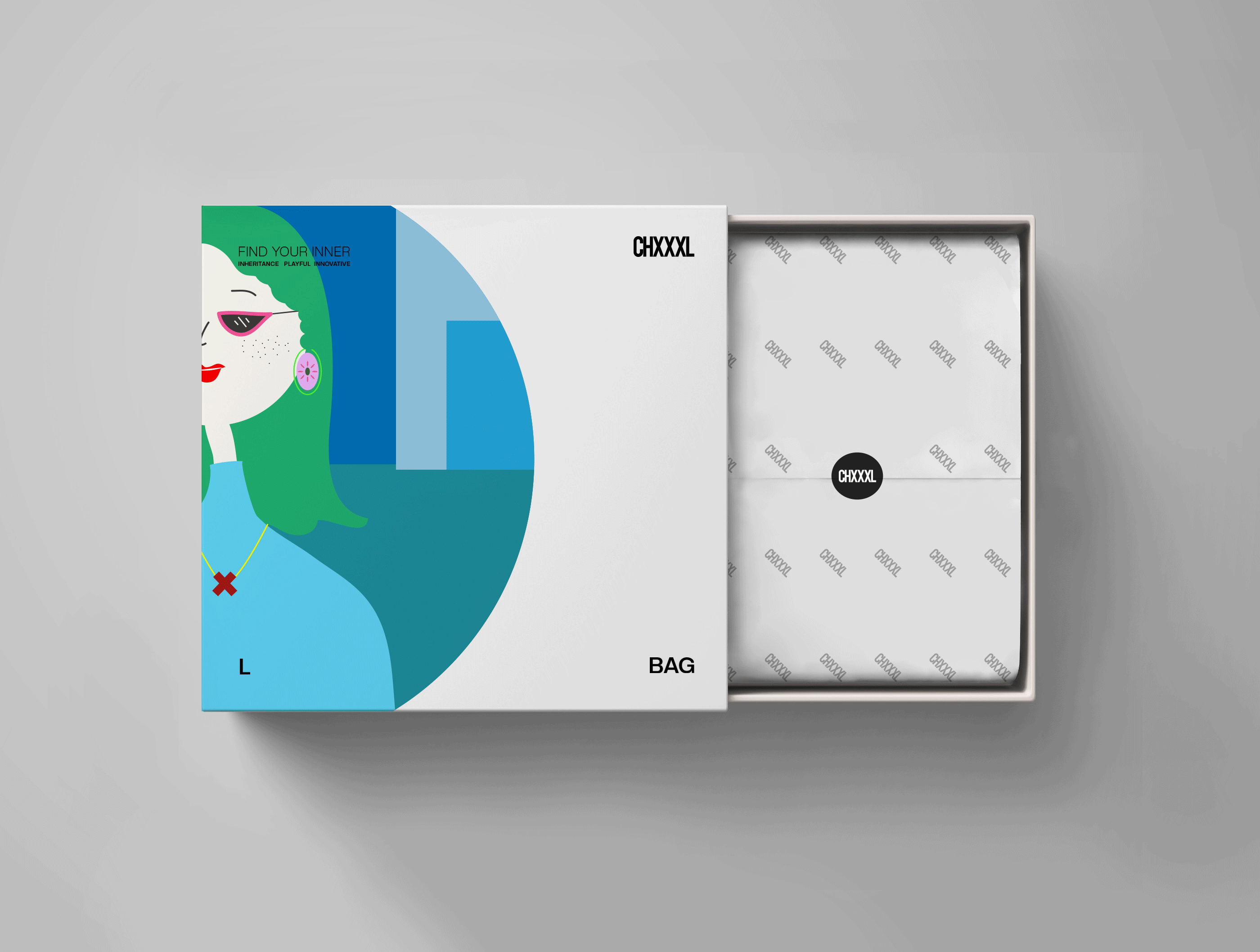
The packaging of XL bags and accessories is based on the lightness, high saturation, and vitality of the current season's products. It tries to use bright illustrations to contrast with the daily black and white monochrome system, so as to convey the brand's diverse definitions of "inner" in the slogan.
XL包饰品类的包装以契合当季产品的轻快、高饱和、活力为核心,尝试使用明亮的插画形式与日常的黑白单色系形成反差,以此传达品牌对slogan中”inner“定义的多样性。
XL包饰品类的包装以契合当季产品的轻快、高饱和、活力为核心,尝试使用明亮的插画形式与日常的黑白单色系形成反差,以此传达品牌对slogan中”inner“定义的多样性。
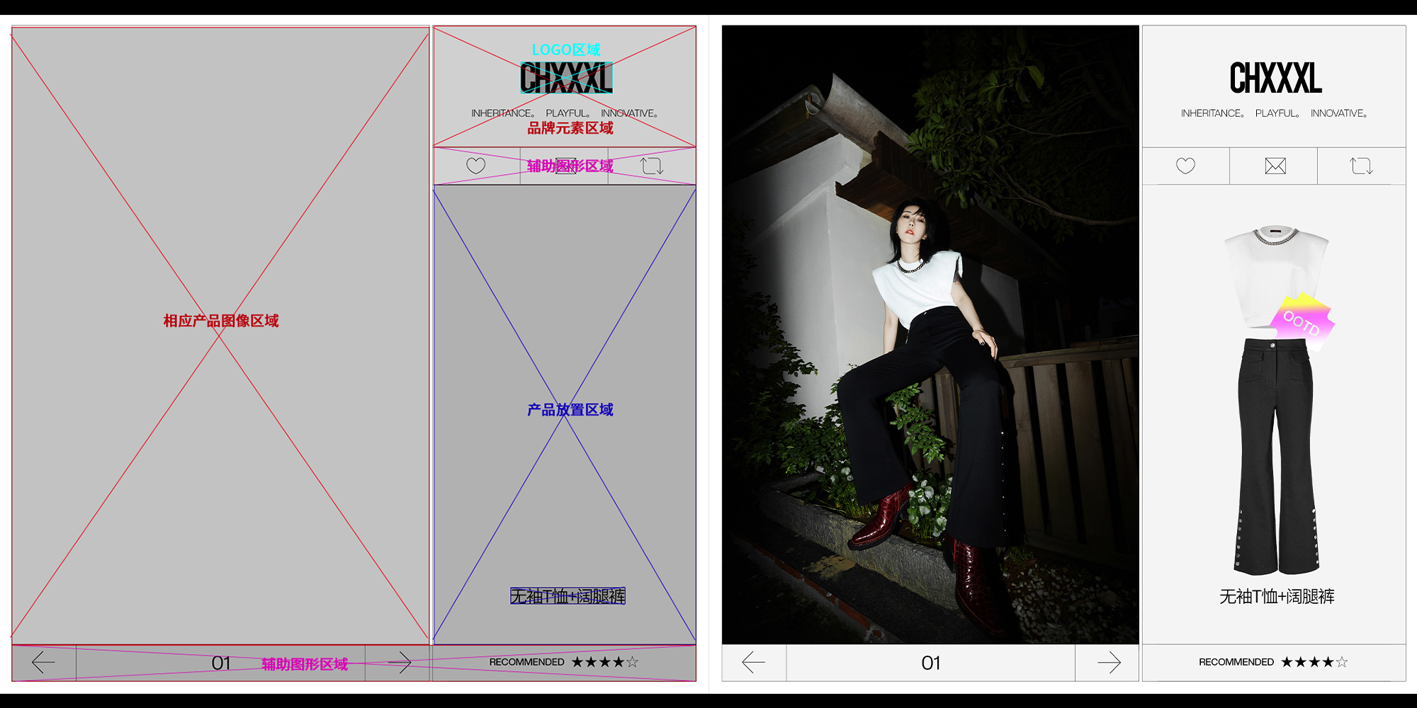
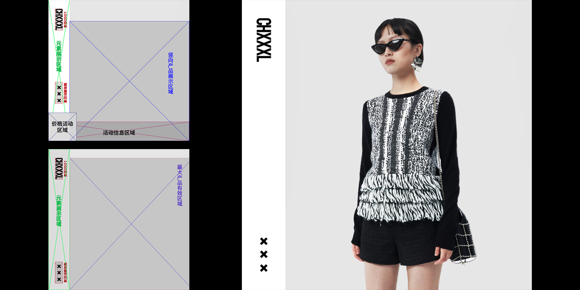
Specification。
︎︎︎
规范。模板。
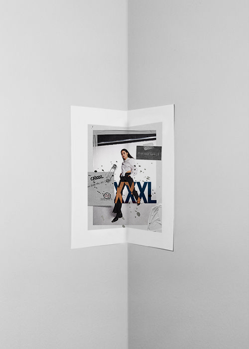
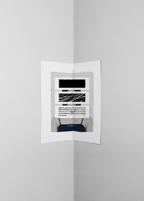
Lay Out。Design。
︎︎︎
日常页面设计。